PROBLEM
The main challenge for BING was merging skate culture, brutalism, and barbering. We knew the visual identity had to feel both futuristic and nostalgic—a mark that truly embodies the brand’s character: rebellious, grassroots, and rooted in a subcultural community.
RESULT
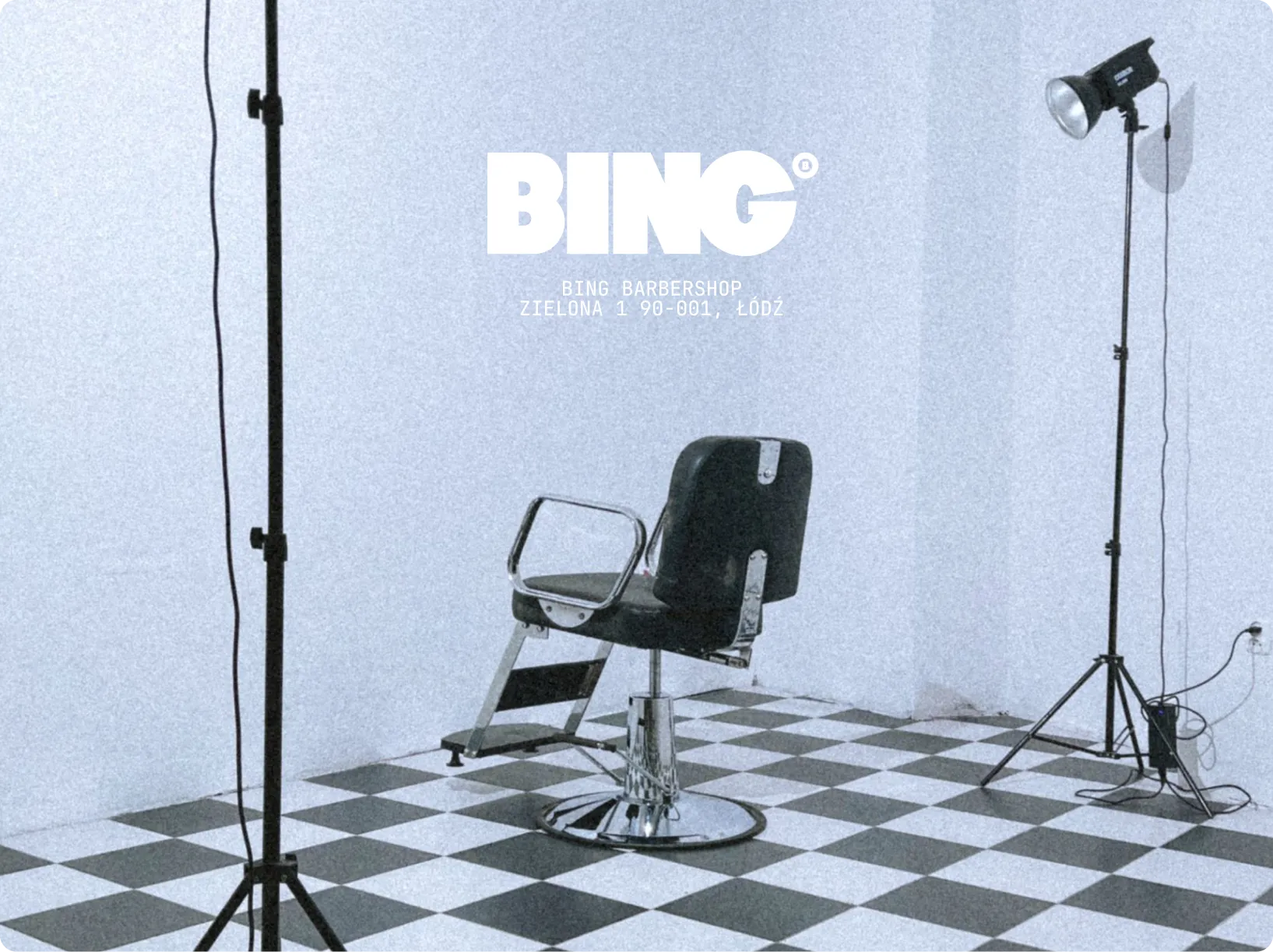
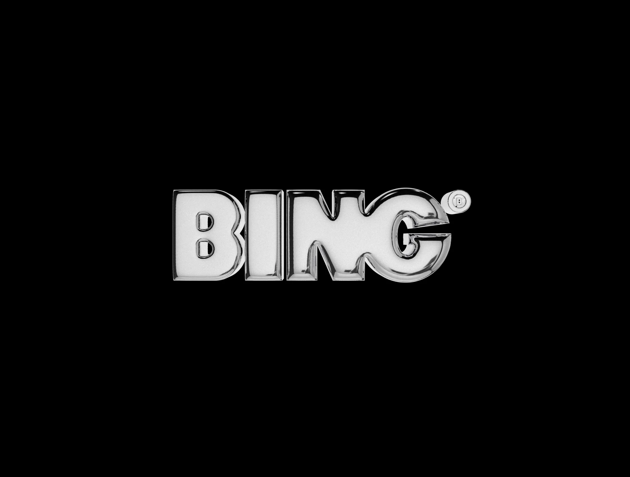
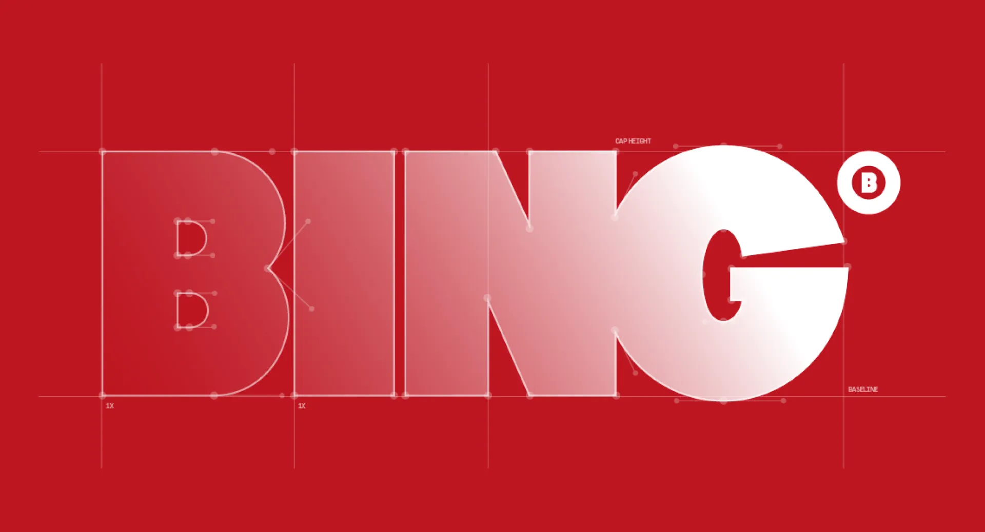
The lettering in this logo was hand-drawn to achieve its specific character. Inspired by old-school skate brands, the typography is clean, bold, and simple, designed to contrast with a "trash" aesthetic. Our visualizations demonstrate how this mark functions in real-world spaces. The focal point is the letter G; its slightly off-grid geometry and sharp diagonal stroke add a sense of dynamics and edge to the entire brand mark.